
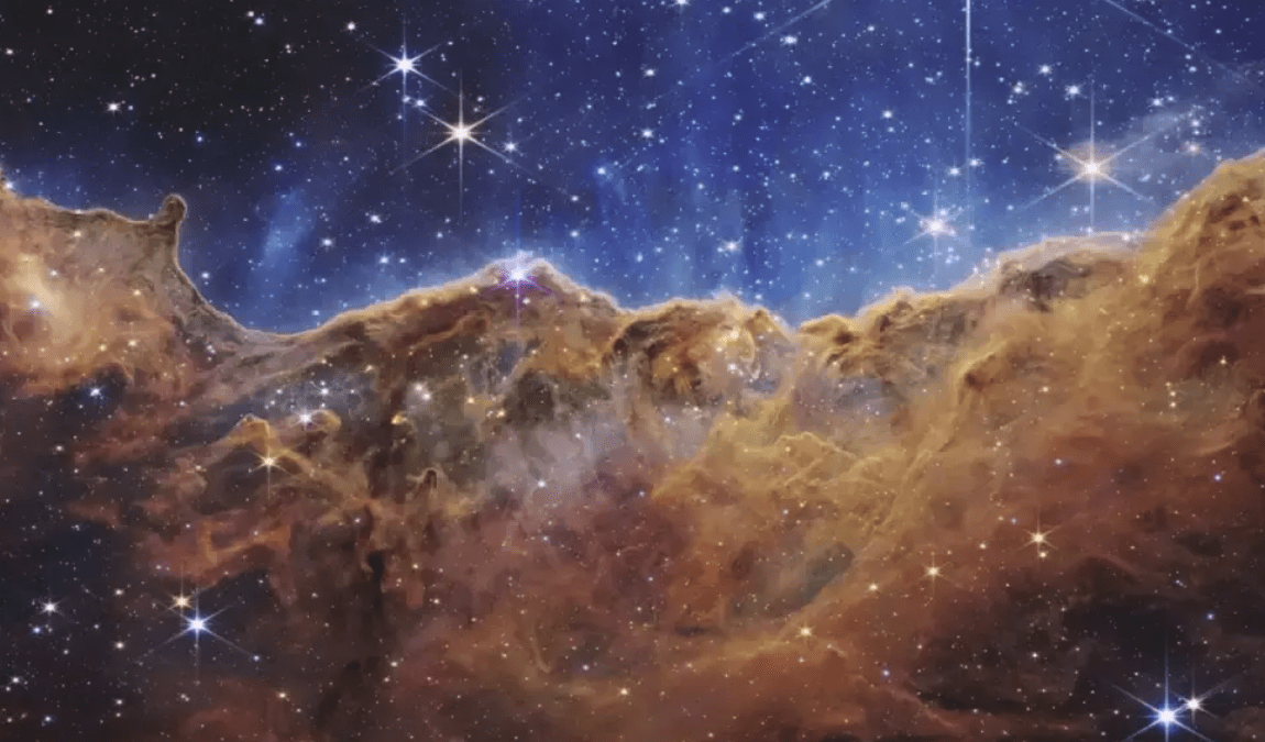
The James Webb Space Telescope (JWST), presenting a mosaic of scientifically relevant and visually captivating images, has garnered widespread recognition under NASA’s oversight for its unparalleled precision and sensitivity in documenting the universe.
Observing the universe in wavelengths extending beyond the visible spectrum, JWST operates as an infrared telescope. As a result, direct observations of these celestial phenomena may evoke imagery resembling that captured by telescopes such as the Hubble Space Telescope, which are primarily sensitive to visual light.
There are persistent questions about the genuineness of these colors: do these cosmic wonders genuinely exhibit such vibrant hues, or are they subject to artistic interpretation? Alyssa Pagan, a science visuals developer linked to the Space Telescope Science Institute (STScI), delves into this uncertainty, stressing that while answers evade us, the differences in human perception of the universe become evident.
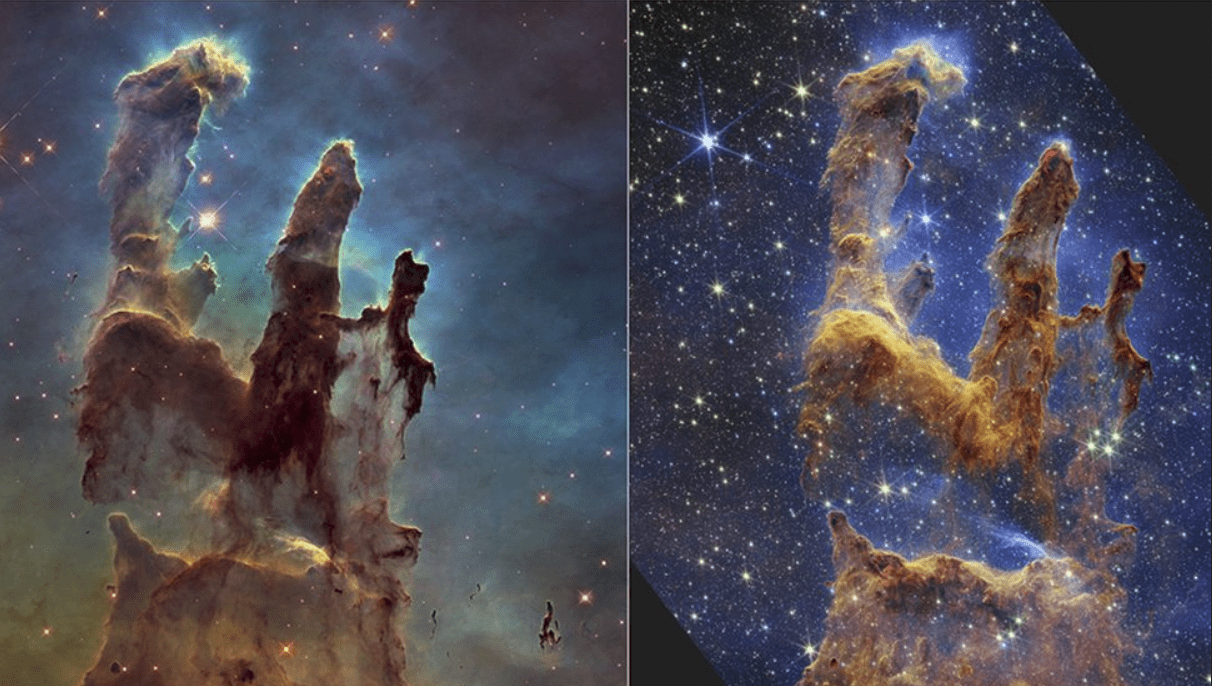
Nevertheless, juxtaposing JWST with Hubble exposes flaws in the comparison, given Hubble’s superior sensitivity and scale. Furthermore, visual-light telescopes may capture divergent facets of an image compared to infrared counterparts, even when honing in on the same cosmic entity.
The colors in JWST images are chosen through a meticulous process. The telescope employs several filters to capture images in different ranges of infrared wavelengths. Pagan, along with Joe DePasquale, utilizes these filters to create composite images, where each filter corresponds to a specific color when translated into visible light.
The resulting images, initially monochromatic, undergo colorization based on the relationship between wavelengths and visible light colors. This process ensures that the longest wavelengths appear as red, while shorter wavelengths manifest as blue or purple.
While the color images do not provide direct scientific data, they serve as invaluable tools for communication and engagement. Collaborating with researchers, Pagan and DePasquale ensure the images remain scientifically accurate, potentially highlighting areas for further investigation. For instance, the distinctive red hue of the most distant objects in JWST’s deep-field view offers insights into the early universe, prompting subsequent research endeavors.
The iconic comparison between images of the Pillars of Creation taken by Hubble and JWST underscores the disparities between visual-light and infrared observations. In the JWST image, the pillars exhibit golden and orange tones, indicating their emission lies closer to the middle of the infrared spectrum. Additionally, the JWST image reveals more regions of star formation obscured by gas and dust, elucidating previously obscured details.
Ultimately, while the colors in JWST images may not mirror reality, they serve to enhance scientific understanding and engagement, bridging the gap between the invisible infrared realm and the human perception of the universe.

, presenting a mosaic of scientifically relevant and visually captivating images, has garnered widespread recognition under NASA’s oversight for its unparalleled precision and sensitivity in documenting the universe. Observing the universe in wavelengths extending beyond the visible spectrum, JWST operates as an infrared telescope. As a result, direct observations of […]&media=https://wonderfulengineering.com/wp-content/uploads/2024/04/ezgif.com-resize-3.jpg)