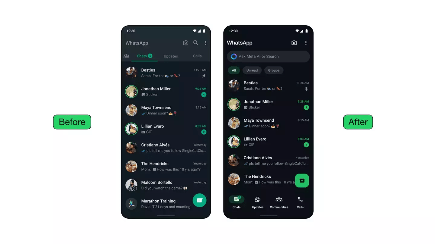
WhatsApp, owned by Meta, has received both praise and criticism for the substantial updates it has made for users of iPhones and Android phones.
Idit Yaniv, Head of WhatsApp Design at Meta, explained that the updates aim to provide “better organizational tools for messages.” She highlighted the introduction of chat filters to help users quickly locate important conversations.
“Recently, we introduced chat filters that help you focus on and find important conversations faster. Moving the navigation bar on Android to the bottom allowed us to design filters at the top of the chats list, so people can quickly find the right conversations without scrolling through their full inbox,” Yaniv elaborated.
Users can now switch between unread and group filters with a single tap, making catching up on missed messages or favorite group chats easier.

The app’s icons have also been updated to a “more rounded, outlined style” for a “playful aesthetic,” and the default chat background has been refreshed. “We learned most people used the doodle, but there was an opportunity to make this even more unique and more related to everyday conversations,” Yaniv added.
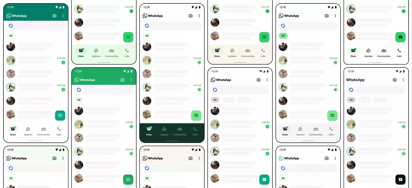
However, the new ‘green’ theme is the most controversial change. Many users have taken to social media to express their displeasure. One user on X commented, “My WhatsApp just turned green. I wanna vomit.”
Another user remarked, “This green WhatsApp update gives me a headache because wtf is everything green?” A third user added, “Ewwwwwwww, why has WhatsApp changed to green? This is worse than the capitalized Typing…”
Not everyone disliked the new color scheme. Some users appreciated the change, with one saying, “I like all the green that WhatsApp added to the app,” and another asking, “By now, everyone is used to and has adjusted to the new WhatsApp green, right? It’s not so horrible, right?”

Yaniv explained the rationale behind the color update, stating, “We considered over 35 color iterations, ultimately aligning with WhatsApp’s iconic green and opting for a palette that allows for harmonious color pairings throughout the app. We also increased the usage of neutral colors, enabling us to be more selective about where and how the green is used.”
WhatsApp has also enhanced the dark mode in response to user requests, increasing contrast and deepening tones to reduce eye strain in low-light environments.
As WhatsApp continues to evolve, the blend of user feedback and design innovation will shape the app’s future updates, ensuring it meets the needs and preferences of its diverse user base.


