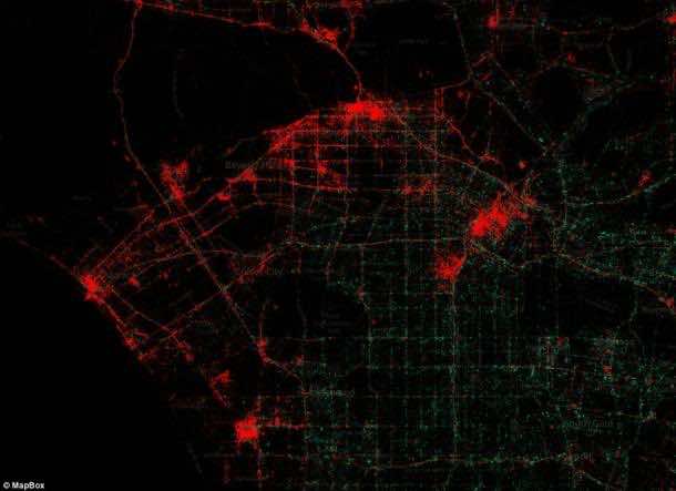
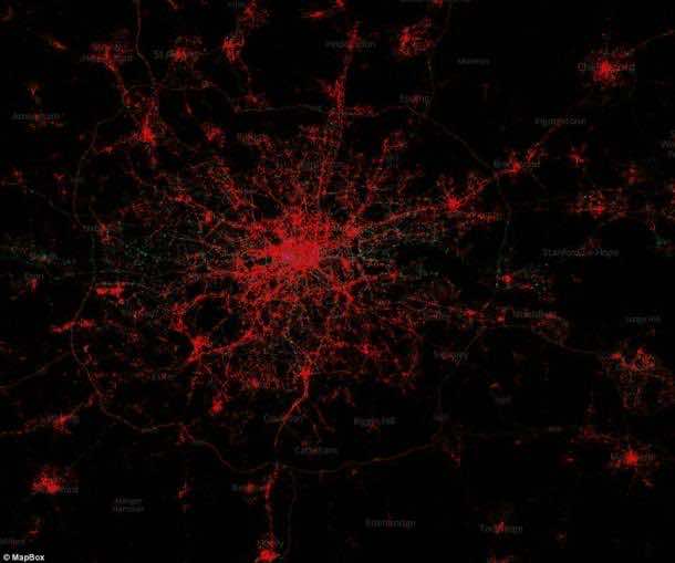
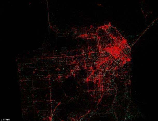
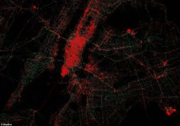
It is often said that a person’s mobile phone can not only disclose his income but can also foretell the part of the town where he lives. new maps generated by a research study show that in the biggest cities of the world, Apple’s iPhone owners live in rich areas, whereas the residents of the areas having lower income own an Android phone. The map below shows that Apple product owners (shown in red) live in central areas while Android owners (shown in green) prefer to live in suburbs of the cities.
As per the app makers and promoters, the owners of iPhone spend and download a lot more apps as compared to Android users. In the past few years, android is becoming very popular and has been favored by many low cost handset makers. Nevertheless, Apple does charge a premium on its products. Even its iPhone 5C is much more costly than an Android handset.
 It has also been uncovered in the research that the Android users download apps with a much lesser frequency. Despite the fact that 80%of market share is owned by android, the app makers claim that the amount of money they make from iPhone users is twice as compared to the amount of money they earn from android users. In addition to this, instead of taking benefits from its abilities, a lot of Android holders were certain of using their hand phones as a ‘dumb’ phone.
Consistent with the latest figures, the total downloads from the Apple App Store are 50 billion, which are still more than newly advertised 48 billion downloads from Google Play’s.
 According to the research conducted by a mobile firm, Flurry, the value of Android customer is quarter as much as an iPhone user when it comes to advertising.
MapBox and Gnip are the companies that conducted this study and made the maps. MapBox said, “Mobile Devices is a map that reveals the information about phone brands that is stored when people use an official Twitter App and is hidden in the metadata attached to each tweet.”
A different color has been provided to each brand of phone which can be changed independently. “The patterns of usage in each city often reflect economic stratification. For example iPhones, in red, are predominantly in wealthy sections of the city while Android phones, in green, have more coverage in poorer sections.”
 More than 3 billion tweets were studied by the firm. They said, “This is a look at 3 billion tweets – every geotagged tweet since September 2011, mapped, showing facets of Twitter’s ecosystem and user-base in incredible new detail, revealing demographic, cultural, and social patterns down to city level detail, across the entire world.”
“We were brought in by the data team at Gnip, who have awesome APIs and raw access to the Twitter firehose, and together Tom and data artist Eric Fischer used our open source tools to visualize the data and build interfaces that let you explore the stories of space, language, and access to technology.”
However, there are no sweeping statements. Not every android user is poor and not every Apple user is rich. This study shows the trends in consumers when it comes to smartphone usage.
Do you agree to this study? Let us know in the comments section below.


Twitter (Tweets) should not be your(Gnip and MapBox) basis in making a map. Many phone users dont use twitter or the tweets in that 3 billion majority are using Apple products, how about the 5 billion? 6?. You should find a way to make an ACCURATE map not by tweets but by the BRANDS. I use an Android phone and tablet but I dont live in a poor area. The point here is not to release inaccurate maps unless proven. (Opinion)