
Apple’s most dramatic interface overhaul in more than a decade has finally started to look the way it was originally promised. With the release of iOS 26.2, Apple has made meaningful changes to its Liquid Glass design system, addressing many of the complaints that followed the launch of iOS 26, according to BGR.
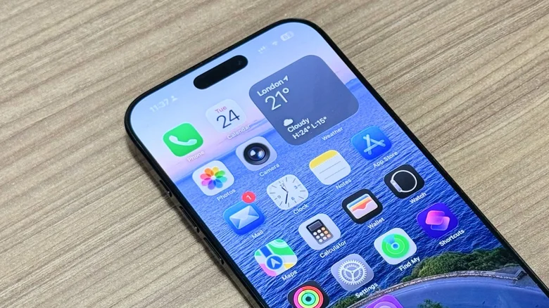
When Apple unveiled Liquid Glass at WWDC, the company described it as a new visual language that would make iOS feel more expressive and dynamic without sacrificing familiarity. The design relies on translucent layers that reflect and refract light, creating a sense of depth and motion across the interface. In practice, the first public versions of iOS 26 struggled to balance visual flair with usability, particularly when it came to readability.
During the beta cycle and early public releases, Apple repeatedly adjusted Liquid Glass in response to user feedback. Icons appeared overly translucent, text contrast varied depending on wallpaper choice, and some animations felt muted compared to the versions shown on stage. While the design ambition was clear, execution lagged behind the vision.
Courtesy: BGR
That gap narrowed with iOS 26.2. One of the most noticeable improvements is on the Lock Screen, where Apple introduced new Clock styles labeled Glass and Solid. These options allow users to choose how transparent the clock appears against their wallpaper, making it significantly easier to read without abandoning the Liquid Glass aesthetic. The settings are accessible by long pressing the Lock Screen, selecting Customize, and tapping the clock itself.
Apple also expanded system-wide controls to tame transparency. An option introduced in iOS 26.1 allows users to reduce Liquid Glass transparency through Accessibility settings, blurring certain backgrounds to improve legibility. In parallel, Apple added a dedicated Liquid Glass menu under Display and Brightness, where users can switch from Clear to Tinted mode. The tinted option increases opacity while adding contrast, subtly shifting Liquid Glass from decorative to functional.
These refinements suggest Apple has accepted that a single visual approach cannot suit every user or wallpaper. While Liquid Glass remains the default design direction, iOS 26.2 offers more practical ways to adapt it to real-world use rather than forcing users to adjust their habits around it.
The result is not a radical redesign, but a course correction. Liquid Glass in iOS 26.2 feels closer to the confident, polished interface Apple previewed earlier in the year, rather than an experiment still searching for balance. As Apple continues to iterate, the evolution of Liquid Glass may become a case study in how ambitious design changes mature only after meeting millions of users outside the keynote stage.
