
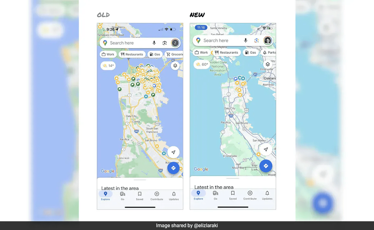
Google Maps recently introduced a revamped color scheme, replacing the familiar white and yellow roads with various shades of grey. This alteration, although met with praise by some, has sparked criticism from users who find the updated colors less vibrant and the contrast lacking.
Elizabeth Laraki, a pivotal figure in Google Maps’ design history, expressed her dissatisfaction with the recent visual overhaul on X, stating, “15 years ago, I helped design Google Maps. I still use it every day. Last week, the team dramatically changed the map’s visual design. I don’t love it.” Laraki contends that the new palette, despite making major roads and trails more prominent, fails in creating a visually appealing and user-friendly map.
She specifically critiques the blending of water, parks, and open spaces, emphasizing that while the goal was to enhance usability and readability, certain elements now lack distinction. Laraki argues that the team missed a crucial opportunity to declutter the map, suggesting that the overlaying of features like the search box, latest updates, and restaurant tabs hampers the user experience.
According to Laraki, the map should be considered sacred real estate, with only highly useful features remaining visible. She proposes a drastic simplification, emphasizing strong prioritization of map visibility and the removal of legacy and low-use features. Laraki highlights that while it’s common for products to accumulate features over time, constant vigilance is essential to ensure ongoing cleanup.
Reflecting on history, Laraki draws parallels to 2007 when Google Maps faced a cluttered interface. At that time, a redesign was imperative to address user experience issues and accommodate the product’s growth. Laraki suggests that Google Maps is at a similar crossroads, urging for a renewed focus on simplicity and scalability for the future.
In essence, Elizabeth Laraki’s critique serves as a call for Google Maps to revisit its design philosophy, echoing the need for simplicity and user-centric prioritization in the ever-evolving landscape of digital mapping.
