Check out the following 31 logos from some of the famous brand names that contain hidden messages. Read on to find out!
31. Amazon
The yellow arrow seems to represents a smile, however, it is an arrow pointing from A to Z implying that Amazon sells everything and the resulting smiley face denotes the happiness that customers experience when they shop at Amazon.
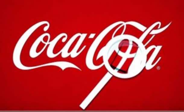
30. Coca-Cola


The O in the Cola represents the flag of Denmark, the happiest country in the world.
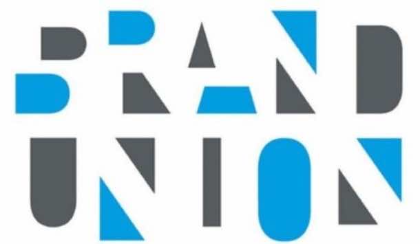
29. Brand Union
The blue and black shapes have been placed so that the negative spaces make the brand’s name.
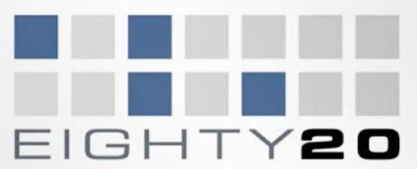
28. Eighty 20
The clue lies in the blue squares. Two lines denote the binary sequence with the blue squares being ones and the grey ones being zeros. 1010000 is ‘80’ and the 0010100 is ‘20’.
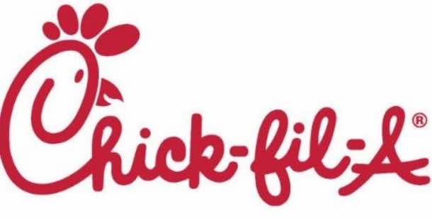
27. Chick-Fil-A
The designers managed to get a chicken into the logo and the letter C forms a chicken head!
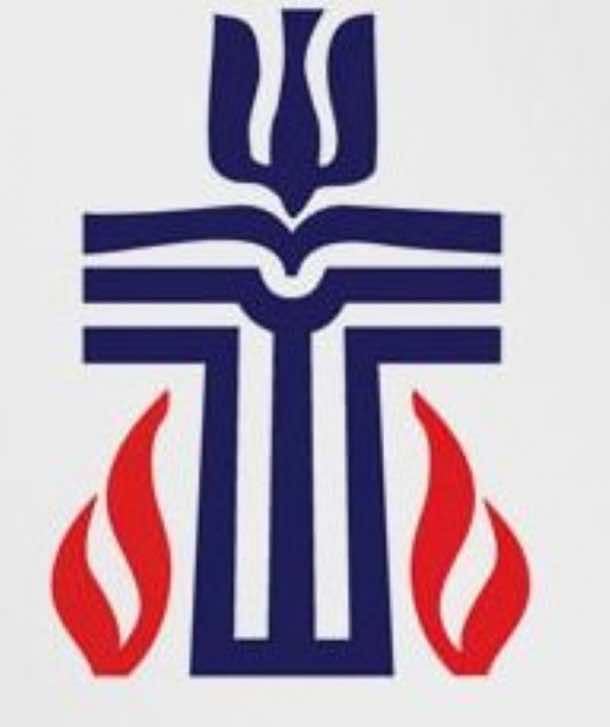
26. Malcolm Grear and Associates
The logo contains a dove, pulpit, Bible, clerics robe, fish and flames! Yes, the seemingly a simple cross contains all this!
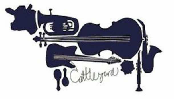
25. Cattleyard
The company is related to music business and the logo contains a cow made from different musical instruments.
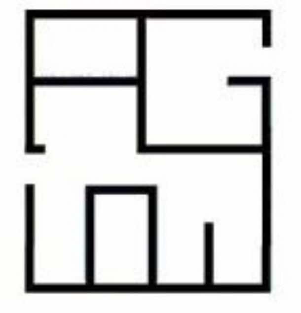
24. A G Low Construction
The company specializes in designing floor plans and looking at the logo tells exactly that by incorporating a floor plan of a house.
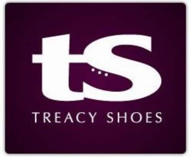
23. Treacy Shoes
The logo shows t and s for the company’s name, however, look closely and you’ll find a shoe in there as well!
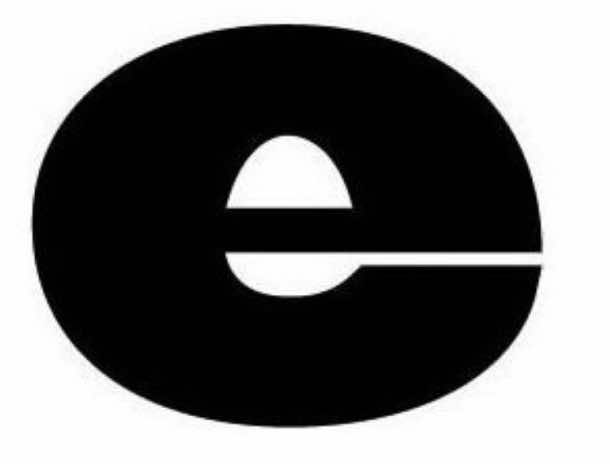
22. Egg and Spoon
The letter e contains the shape of an egg and a spoon.
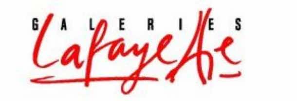
21. Galeries Lafayette
Look closely at the word Lafayette and you’ll find that it represents Eiffel Tower.
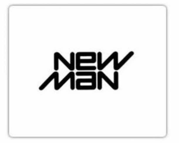
20. New Man
The logo remains the same even when you turn it upside down!
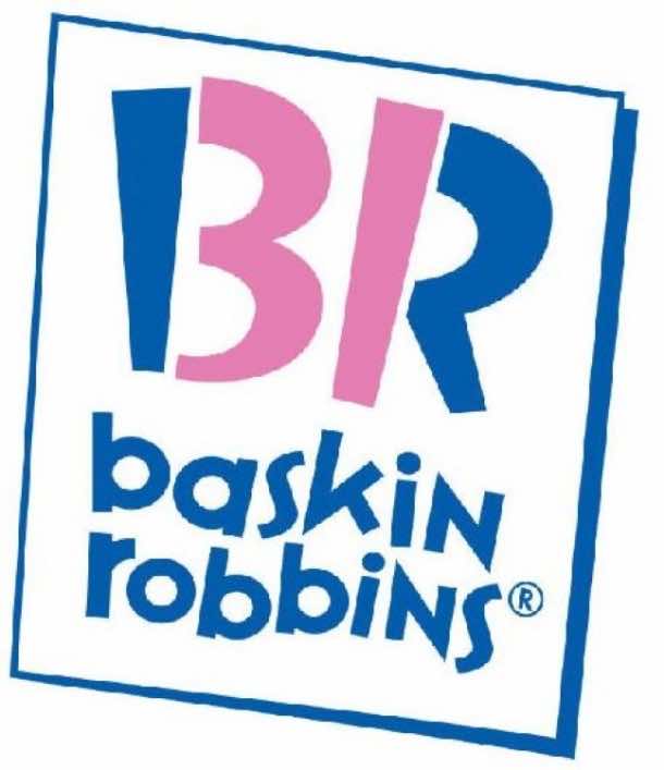
19. Baskin Robbins
The logo has the initial BR, however, if you look closely you’ll also find that the logo contains 31 representing the 31 flavors that were originally offered.
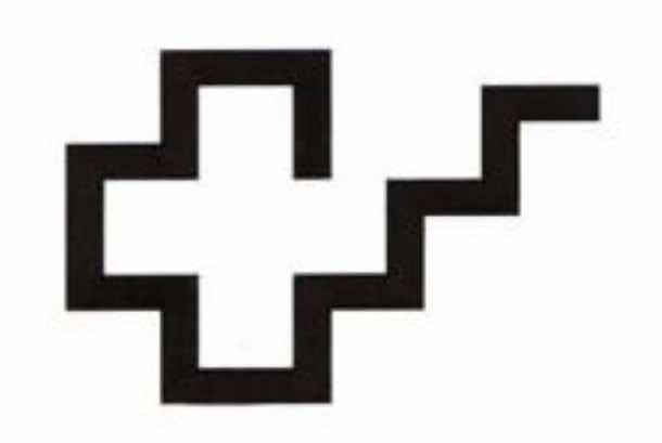
18. Rehabilitation Hospital Corporation of America
The cross symbol is the well known symbol for medical attention and help and the steps leading up represent getting back to a normal life.
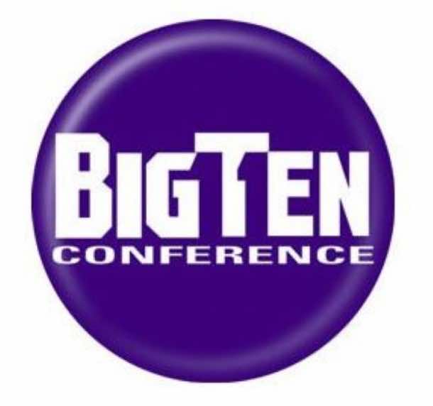
17. Big Ten Conference
There are a total of 11 schools in the Big Ten Collegiate Conference and looking closely at the logo shows number ‘11’ contain between the letter G,T and E.
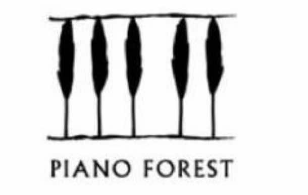
16. Piano Forest
The black and white piano keys apart from representing the obvious piano keys, also represent black trees on a white background.
15. L.S.O
The logo shows a line, continuous, connecting the initials, however, it represents the rhythm of orchestra that is unbroken.
14. Guild of Food Writers
The company provides culinary education and food writing and the logo has the nib of a fountain pen that contains a spoon inside it.
13. Yoga Australia
The logo shows a woman practicing yoga, however, if you look closely you’ll find that the woman represents the map of Australia.
12. Northwest Airlines
The logo has N and W for the Northwest and these alphabets are contained within a circle that denotes a compass that point towards NW.
11. Forkwire
This company is an online food delivery company and has incorporated a fork into the @ symbol!
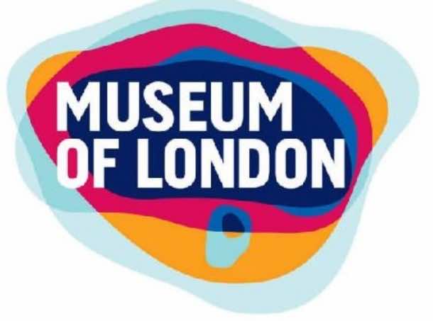
10. Museum of London
The colors and shapes represent the London’s geographical area as it has changed over time.
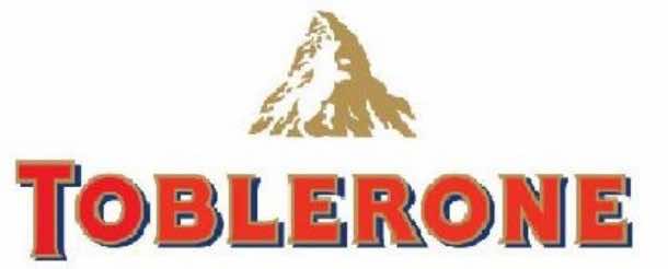
9. Toblerone
This logo shows the Matterhorn Mountain from where Toblerone originated. An image of bear can be seen too if you look closer!
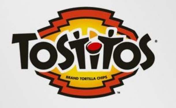
8. Tostitos
Looking closer at the logo will reveal letters ‘T, I and T’ showing two persons sharing chips over a table.
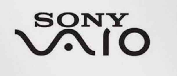
7. Sony Vaio
The first two letters represent the basic analogue signal while the last two represent the digital signal.
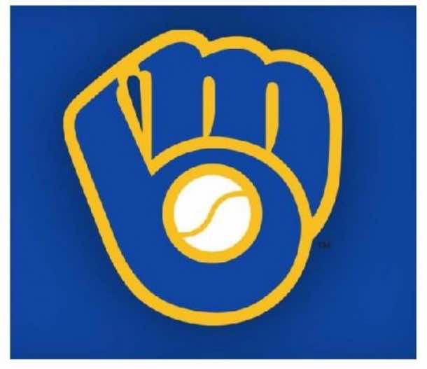
6. Milwaukee Brewers
The previous version of the Milwaukee Brewers’s logo looked like a catcher’s mitt that was holding a baseball, however, taking a closer look reveals that the mitt is actually letters M and B.
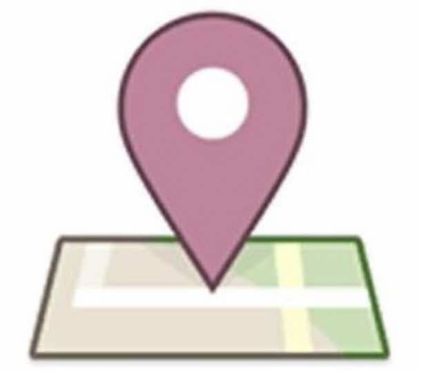
5. Facebook Places
A geo-locational product of Facebook wit its main competitor being Foursquare. Surprisingly, the logo shows a square with number 4 in it. Coincidence?!
4. FedEx
Looks simple and nothing fancy, however, look closer at the negative space between the letter E and X; it is a white arrow. The arrow denotes the speed at which company delivers.
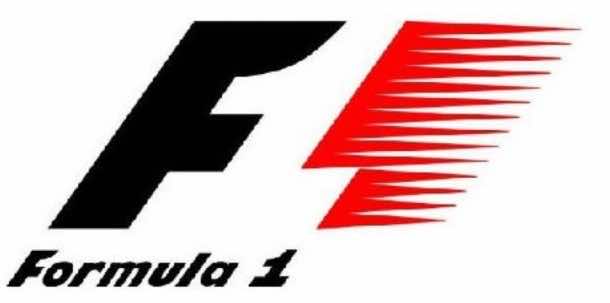
3. Formula 1
The negative spacing creates the number 1.
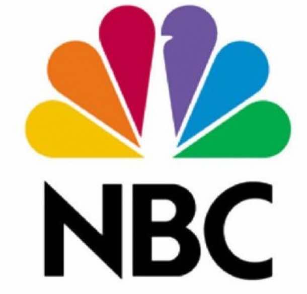
2. NBC
You can spot a peacock in the logo’s middle right above the text if you look closely. It is looking to the right implying company’s motto of always looking forward and moving forward. The peacock also represents the pride company has in the shows that it offers.
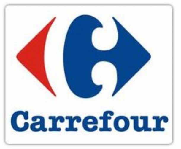
1. Carrefour
It is a French name for Crossroads and the logo sports two arrows opposite each other while the negative space between them shapes up the alphabet C.


