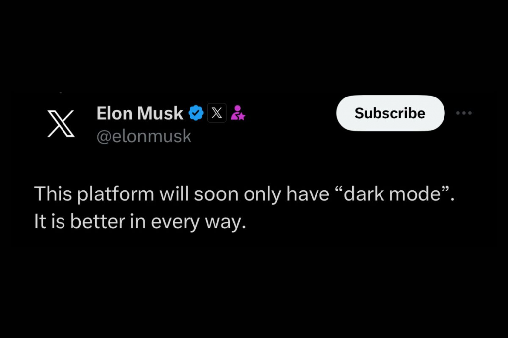
Elon Musk, the controversial CEO known for his bold statements and groundbreaking innovations, has once again sparked a heated debate, but this time, it’s not about electric vehicles or space travel. Musk has taken a stance on the light mode versus dark mode debate, and his remarks have stirred up Twitter, which is currently undergoing a rebranding to X.
In a tweet posted early this morning, Musk announced that the popular social media platform, Twitter, will soon adopt “dark mode” as its default interface. He boldly declared that dark mode is superior in every way. The response to his announcement was swift and passionate, with users divided over the potential change.
Advocates of light mode were quick to point out that reading light text on a dark background can strain the eyes, making it harder to read for some users, especially those with visual impairments. They pleaded with Twitter to retain a light mode option even if dark mode becomes the default for the platform’s new design identity.

On the other hand, proponents of dark mode praised Musk’s decision, asserting that the dark interface is easier on the eyes, reduces glare, and conserves battery life, particularly on devices with OLED screens. Many users have grown accustomed to full-time dark mode on their devices and appreciate apps that automatically adjust to their preferred settings. Twitter, currently offering multiple background options based on individual preferences, includes light mode, a dim setting with a dark blue or gray background, and “lights out,” which features a full-on black interface. As the platform transitions to its rebranding as X, the gradual changes have already started with a makeover of the Android app, showcasing the new name and logo in the Google Play Store. Presumably, the iOS app will soon follow suit.

Musk’s impact can’t be denied, but how will Twitter’s community digest the switch to dark mode by default? Rebranding is more than skin deep—it looks like a ploy to get advertisers to up their investment with Twitter. Those coveted blue checks—what people crave more than anything—are now being used as bait for brands to bite back into Twitter.
We’ve been discussing the tussle between dark mode and light mode for a long time, and it doesn’t look like we’ll be settling this any time soon. It’s up to each individual user to decide which design they prefer– some might prioritize convenience, while others may opt for style. As Twitter looks ahead to its exciting X-ization, it’s important that they find harmony between pleasing its users while being open to fresh designs in order to remain competitive in the ever-shifting social media realm.


