We are witnessing a change in trend when it comes to housing and the size of houses. The current approach is to go for a minimalistic design where no space goes to waste and is utilized efficiently. Recently a team of 12 students studying architecture at China’s Chongqing University took part in a school exhibition where a tiny house was shown on a whole new level. The house that this team came up with has been designed while considering factors, such as comfort and maximum efficiency while utilizing space efficiently. The house covers an area of 7 square meters only.
Yes, we know, that sounds too less to be true and even if it is true, the design would suck since it is built in such a short area. However, that is the beauty of this design. It has managed to transform this seemingly limited space into an open and spacious home.
Feast your eyes on the design of the house.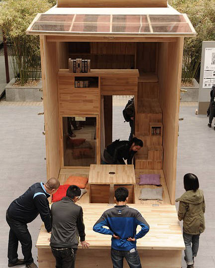
The house has no doors since it is a beta version and also since it is in an exhibition, therefore, not having doors allows people to peek into the house.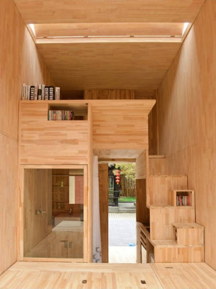
The stairs provide storage space as well.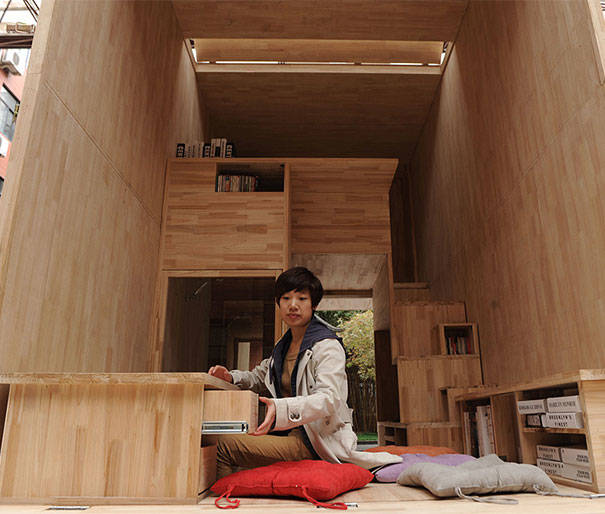
Multiple levels of storage have been incorporated thus making space available for clothes, books or any other stuff you can think of.
The table can be collapsed when not needed.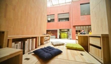
Almost all of the storage spots are capable of doubling up as desks, places to sit or tables.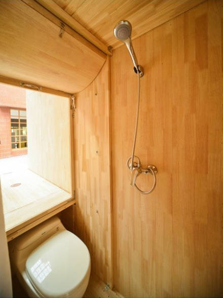
Bathroom has been kept sleek while also ensuring it is functional.
The house has a kitchen with an oven, stove and a sink. Yes, there’s a dishwasher and washing machine fixed in there as well.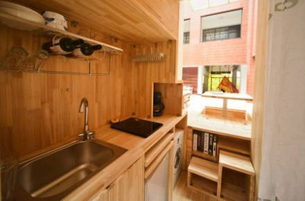
One can find hidden tables and storage areas throughout the kitchen area.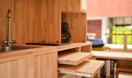
And yes, there is a bedroom that can house a big and comfortable bed.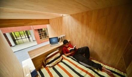
Pretty cool, isn’t it?


Great post! Have nice day ! 🙂 ygbji
Very cool. I definitely couldn’t live in it but they did maximize their space efficiently
Absolutely crazy stuff. Always wanted to have a similar house 😀
Where can I get this or the plans to build it myself? I want one today!!!
Where is the Car Garage ? 🙂
hahahahahha…………:-) savage bro…
WAY too many sharp corners. I doubt anyone’s actually lived in that or they’d be all bruises. And no toddlers allowed, clearly.
Clever. Just clever!
Nice but Imagine getting drunk in a place like that
Its looks like a studio apartment.Very COOL.Great job
How much did this cost the students to build?
Amazing, how people can be creative. Small but functional. The only things that is missings is the window.
Cheers.
Wow, this house looks so cool! And there’s even a shower!
I would need that; houses and apartments are very expensive in Vienna 🙁
Is it supposed to be open if commercialy available or is it just for the Photo and exposition. I can’t see if it’s a window or a missing wall.
its a beta of their real design, not normally open like that
Is cool, but is very small. In China big apartments are very expensive
Profitez de notre étude et comparez gratuitement les offres de prêt travaux et rénovation actuellement disponible
en ligne.