The first modern Olympics event was organised in 1894. Since then, the event has transformed into the biggest sporting competition around the globe.
The designing and branding of Olympics is a daunting challenge. It must convey the richness of heritage and sporting talent, the culture and patriotism of the host nation, the spirit of the sporting competition, and more. All these aspects need to be embodied in a simple design that gives a harmonious look from print material to the giant billboards, and more recently, to the smartphone and computer screens.
Here are the ten prominent logos that show how the greatest tournament on the planet can inspire top notch design.
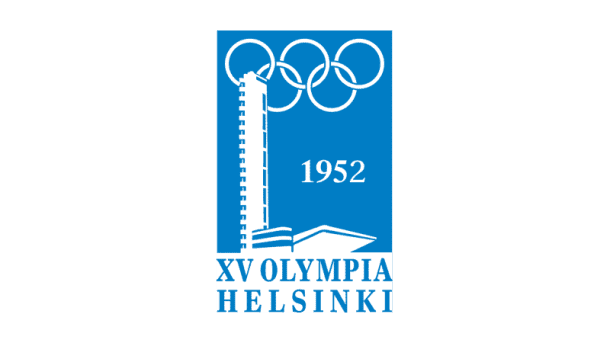
1. Helsinki 1952:
The first series of Olympic Games logos were mostly typographic and quite uninteresting. Things changed in 1952 when Helsinki introduced its logo inspired by the flag of Finland. This one-color design still looks pretty modern after more than six decades.
2. Mexico City 1968:
In 1968, the Chairman of the Olympics Committee, Pedro Ramírez Vázquez asked the design team to: “Create an image showing that the games are in Mexico, that isn’t an image of a Mexican wearing a sombrero sleeping under a cactus.” The result was a strikingly creative logo that developed on the geometry of 5 Olympics rings to form the number 68. The logo was the amalgamation of the Mexican pop art and the folk art depicting Mexico’s modernity and heritage.

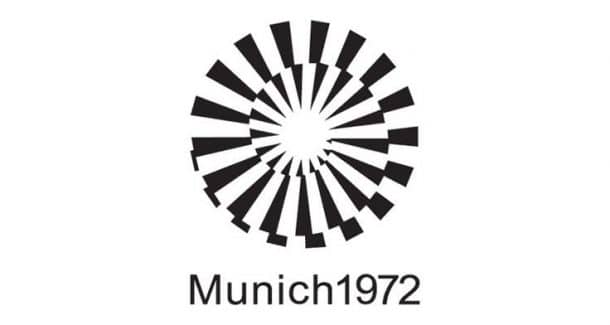
3. Munich 1972:
Most of the Olympics logos tried to depict elements of patriotism and West Germany was bold enough to break the trend. Its logo represented global unity and hope. Its design included the sun that was emitting rays of optimism and hope using a clever spiral effect.
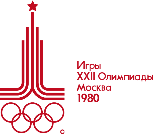
4. Moscow 1980:
These Olympic games were held at the height of the Cold War between US and USSR. This logo is more a show of strength with the star at top symbolising the Kremlin and Soviet symbolism. The red rings below symbolise socialist ideology. Despite the intimidating nature of the design, it is still a classic.
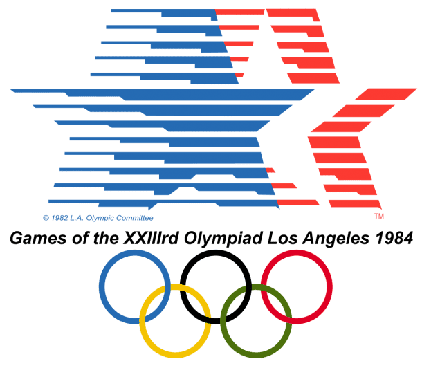
5. Los Angeles 1984:
After Moscow, the next Olympic Games were held in the USA, and this logo was as nationalistic as its Soviet counterpart. Red, blue and white are the colours of the American flag, and one look was enough to indicate where the Olympics is being held. The stars symbolise the ones on US flag, and the stripes show athleticism of the event and the dynamism of the US.
6. Nagano 1988:
This logo design is known as the ‘Snowflower’. An abstract athlete is making six petals around the flower. This design emits energy and radiance and is an accurate representation of the Japanese and universal culture.

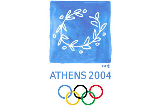
7. Athens 2004:
2004 was an outstanding year for the Olympic games. It was the first time that Olympics came back to their land of origin since the 4th century AD. The design is entirely Greek. It featured a hand-drawn olive wreath (the prize given to winners at Olympus) in the colours of the flag of Greece.
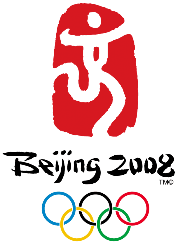
8. Beijing 2008:
Being the emerging economic superpower of the 21st century, Chinese Olympic logo represented national pride. The red colour represents luck and is also the colour of the Chinese flag. The logo shows a figure styled to resemble the word ‘jing’ – it is the second part of Bei-jing and also means capital.
9. Sochi 2014:
This logo is unique because unlike most Olympics logos, it has no elements drawn. The name is in lower-case and also gives URL to the website instead of displaying official name. The OC for Olympics stated that the logo was “the first digital brand in the history of the Olympic Movement”.
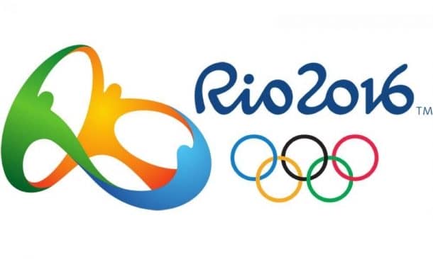
10. Rio 2016:
Yes, Rio was on our list of favourites even before the games begun because of its elegantly simple logo. It has multiple themes, people joining hands to promote harmony and unity, the yellow, green and blue represent the sun, forest and sea which is indicative of Rio’s landscape and the shape is roughly like that of Sugarloaf mountain.
This is our list of classic Olympic logis since 1864. Which logo is your favourite? Let us know in comments.


